The Significance of Color in Architecture and Interior Design
“Color in certain places has the great value of making the outlines and structural planes seem more energetic” - Antonio Gaudi.
Imagine walking into a room painted white from ceiling to floor. How would you feel?
Mundane…
Dull…
Boring…
But now imagine that a wall in that room is painted in a bright color. Doesn’t that change your perception of the room?
Now, the same room appears to be more vibrant, interactive, and lively.
So, to simply quote, colors are powerful because of their ability to evoke emotions. Hence, colors in architecture prove to be an excellent tool for designers for creating meaningful spaces.
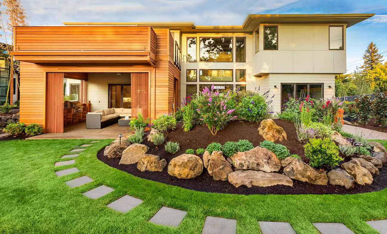
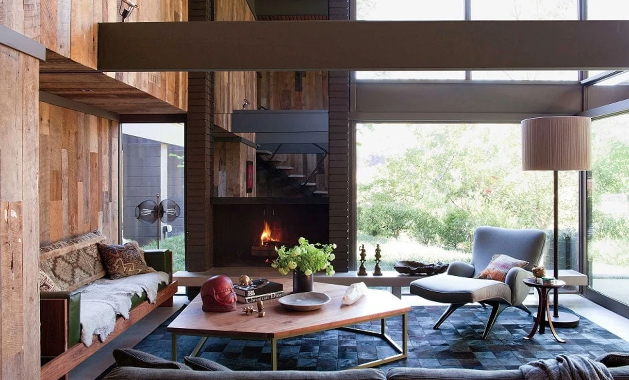
Color Psychology in Architecture and Interior Design
Source: ArchDaily
Colors in architecture are often used to create a psychological impact on the user. They represent symbolism and mysticism and can therefore depict various meanings. Colors can showcase and highlight spatial volume and construction detail under the action of light. The visual effects so created depict a range of emotions that generate psychological stimuli.
For instance, if we paint a darker shade on the ceiling, it creates the impression of a low-height space. Another example would be if we paint the central wall of a room, it creates the visual impression of a shorter space. However, if the color is applied to all walls, the perception of a longer space is created.
In case the adjacent walls of a room are painted, the space feels more compact. But, if you paint the central wall and ceiling in the same color hue, the room seems bigger. Hence, it is important to realize that spaces and colors are deeply connected, thereby enhancing each other.
How Colors Create an Impact
Every color is unique and therefore evokes different emotions in the viewer. Below is a description of how to use various colors for creating an impact on the user of a space.
Red

Source: ArchDaily
The color red is all about passion, excitement, and energy. It is a color of extremities and therefore represents love, hate, fear, danger, and warmth- depending upon its use. Hence, the manner in which a color is applied to a surface determines how it will be perceived. Generally, deeper hues of red can be enticing, while bright reds are affable and attention-seeking. But, if used poorly, red may feel overwhelming. For exterior and interior spaces, red can be used as an eye-catching design element. This color in architecture is great for creating accent walls in home interior design.
Blue
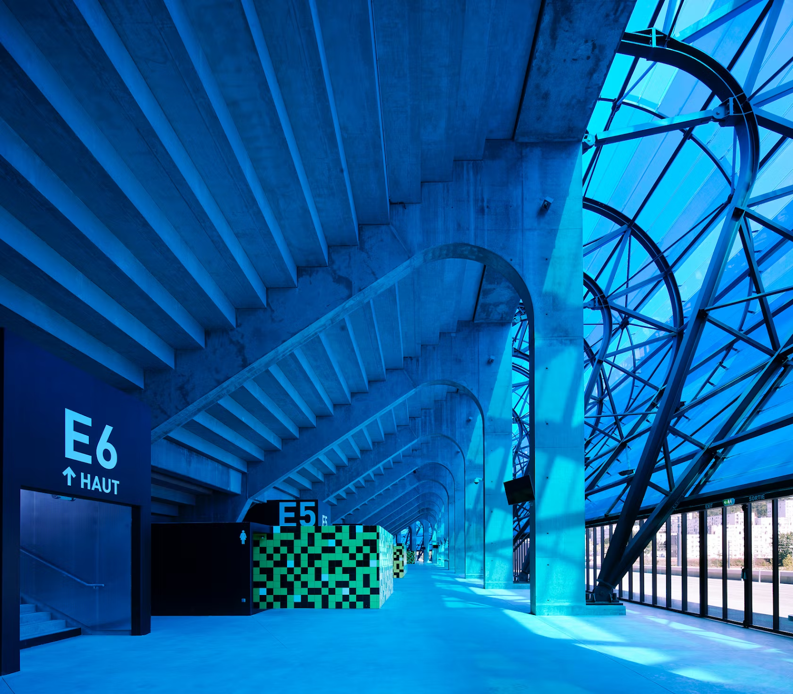
Source: Architizer
Blue is the color of tranquility and hence creates a cool, soothing, dignified, and secure vibe. It is also a color that depicts serenity, focus, and productivity. The use of blue in home interior design evokes a sense of peace and calmness. Blue is predominantly used in commercial spaces to ingrain a sense of formal behavior among the workforce. When used on ceilings blue represents the celestial sky and makes the room feel mystic. Using blue light installations is one of the most popular and effective ways for brightening the outdoors.
Green

Source: Architizer
Green is one of the most widely used colors in architecture but through landscape. Plants have the innate ability to make people feel happier and lighter. Hence, the color of plants- green, creates a zen-like impact on the user of a space. In any shade, green can be used in rooms to create a sense of comfort, warmth, and confidence. However, green should be strategically used in combination with complementary colors to avoid making a space feel clinical.
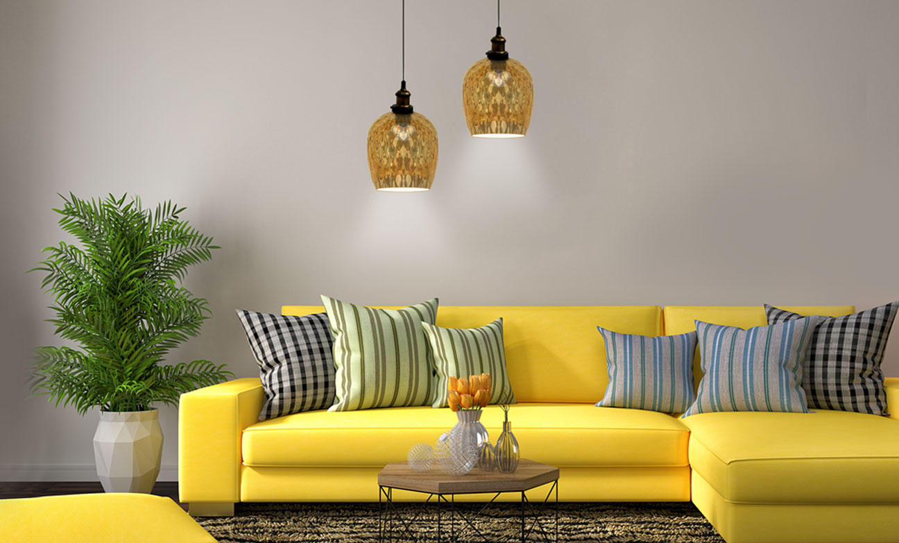
Yellow

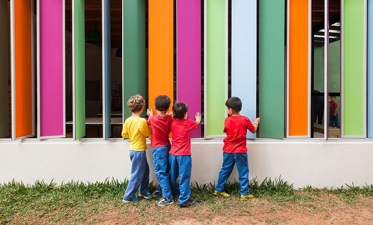
Source: WIRED
The world becomes a better place with the color yellow in it. Touted as the most radiant, cheerful, and heart-warming color, yellow is perfect for highlighting design elements. While yellow is an energetic color, it is not as dominating as red. There is a certain sense of edgy, quirky, and light-hearted sensibility that yellow brings to a space. Hence, yellow is every designer’s first choice for kids' bedrooms, daycares, and kindergartens. Yellow works well in combination with gray and white.
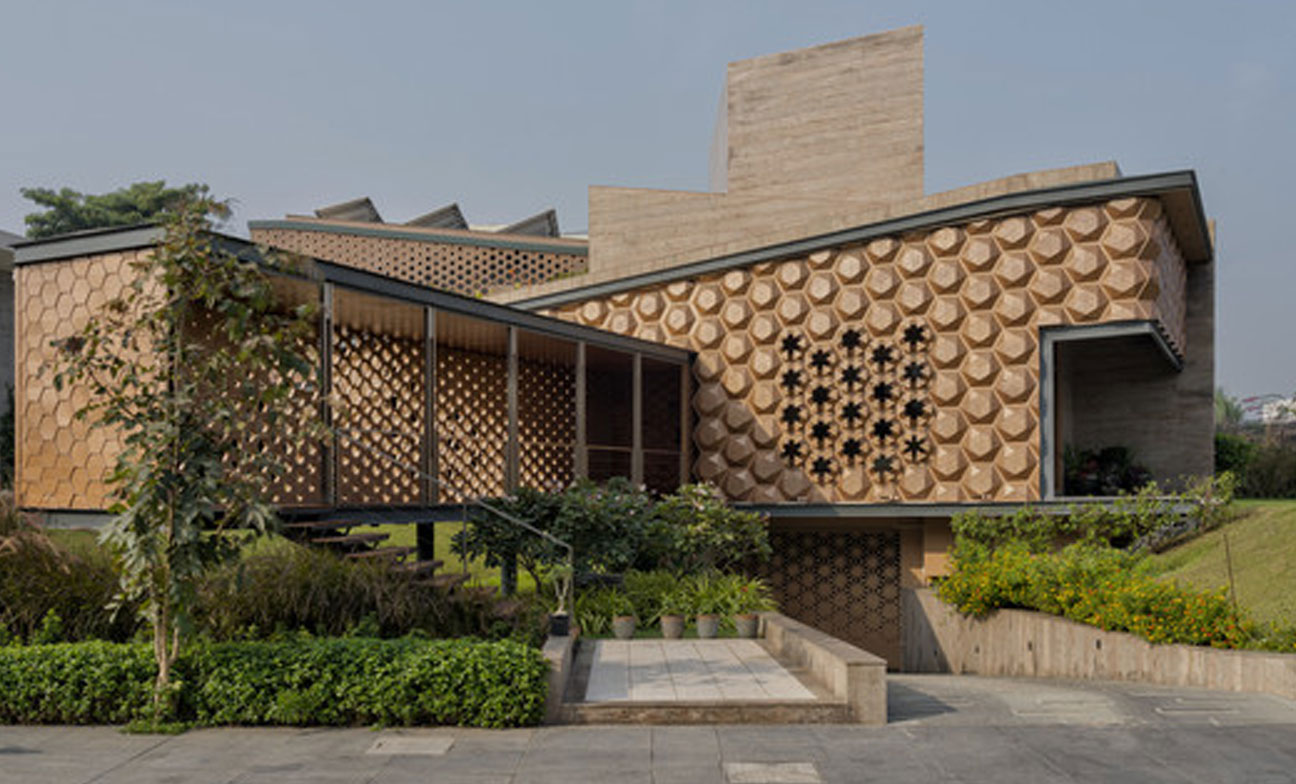
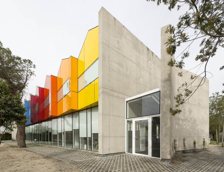
Orange

Source: Architizer
Rarely used in architecture and interior design, orange is a statement-making color that creates a soothing, luminous, and affable space. Lying somewhere between red and yellow, orange brings the best of both colors. It is bright yet jovial and is therefore perfectly suited for home interiors. Used on walls, orange radiates abundance and happiness.
Final Word
Colors in architecture make a space more meaningful and liveable. In combination with the right lighting, materials, pattern, and texture, colors can be highly useful in enhancing the user experience of a space. While using color, architects and interior designers must be mindful of its application so that the appropriate emotions are evoked through their design

About Pragya Sharma
Architectural WriterPragya is an architectural writer and content strategist. Her writings are industry-relevant and easy to understand. With 4+ years of experience, she has created content across various platforms in the format of blogs, social media content, and newsletters.